We’re all familiar with the risk matrix. It’s used throughout corporate risk practice, it’s apparently simple to use, and it’s visually attractive. But to paraphrase Edmund Blackadder [2], there’s just one tiny problem with it – in all its variants it yields meaningless results every time. To demonstrate why, let’s start by examining the commonly used qualitative matrix.
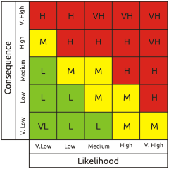 The idea of using qualitative scales is that verbal descriptors of likelihood and consequence are easy to understand, but is this really true? David Budescu and colleagues at the University of Illinois and Fordham University worked on this question for several years with reference to the IPCC verbal likelihood categories of climatic events. Unfortunately this research consistently showed that even subject matter experts in their own field exhibit wild variation when interpreting verbal category labels, and that's not only true of climate scientists. It's a recognised problem known as linguistic uncertainty.
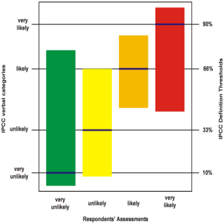 I plotted the graph on the left using the data from one of their research papers.[3] It shows the spread of numeric interpretations for each of four verbal likelihood category labels, clearly demonstrating that they can't be relied on. The words mean radically different things to different people, to the extent that interpretations of ‘very unlikely’ and ‘very likely’ overlap by almost 50%, completely encompassing the two intermediate categories. All the categories are therefore fundamentally devoid of meaning as each one overlaps with all the others to some extent.
As if that wasn't enough, the qualitative matrix has another problem in that it can be populated entirely arbitrarily without any objective relationship between its cell contents and its scales. Thus, even discounting linguistic uncertainty, it doesn't necessarily represent any real-world risk profile at all.
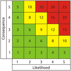 Some folks were rightly concerned about linguistic uncertainty, so they came up with the semi-quantitative matrix. This uses numbers instead of words, both for the scales and the cell contents.
But does it really help? What do the numbers actually mean? Is a likelihood of four twice as great as a likelihood of two (or a hundred times as great if we're using log scales)? Probably not. In fact, the ‘numbers’ are not numbers at all in the arithmetical sense - in this context they're just category labels like the words in the qualitative matrix. So the linguistic uncertainty remains, and other significant problems are introduced by using identical pseudo-numerical scales for likelihood and consequence. The most obvious is a fallacious symmetry about the bottom left to top right diagonal, which implies that a trivial very frequent event and a very rare catastrophic one represent equivalent risk. This is practically never the case in the real world.
Another very important flaw derives from using integers greater than one for the likelihood category labels. This absolutely prevents valid aggregation of likelihoods - an essential process for arriving at total corporate exposure. Where multiple contributory factors must all occur together to result in a given outcome (logical AND), the likelihood of the outcome can obviously not be greater than that of any of the contributory factors. In accordance with basic probability theory the aggregate likelihood of a logical AND set is arrived at by multiplying the likelihoods of its members. Given that the result should necessarily never be greater than any of the input values, it follows that to get the right answer they must be represented on a scale from zero to one. By contrast, multiplying when using the greater than unity numerical scales typical of the semi-quantitative matrix causes the notional logical AND aggregate likelihood to be greater than that of any contributory factor - the inverse of the real relationship.
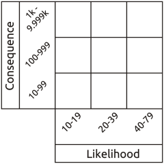 Other folks have recognised the reality that both likelihood and consequence are continuous functions, not intrinsically boxed up in discrete pigeon holes labelled ‘low’ to ‘high’ or one to five. So they label their likelihood and consequence scales with the upper and lower limits represented by each column and row, typically using a frequentist representation of likelihood (the number of times an event is expected to occur in e.g. one year). At first sight this appears to assist in anchoring assessment to reality because we can directly read real world values from the scales, so it's called a quantitative matrix.
Everything seems fine until we calculate the range of risk represented by each cell in the matrix. The results are a monumental failure. This shows up most clearly when we use Red, Amber, Green (RAG) scoring. Everyone loves RAG as it looks pretty and appears to simplify interpretation. Typically, red is interpreted as ‘fix it’, amber as ‘monitor it’ and green as ‘forget it’. So we divide our total range of notional risk values into three bands, assign a colour to each band, and attempt to apply the colours to the matrix according to the values in each cell. But quite apart from the crudeness of this approach with all its associated opportunities for error, it's actually impossible to apply red amber and green colouring to a risk matrix that uses incremental scales without massive errors becoming apparent.
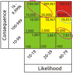 Whatever the placement of the colours, there will always be red cells containing lower risk values than amber cells and amber cells containing lower risk values than green cells. This proves that the matrix itself is intrinsically invalid, so all results taken from it will be nonsense.
I have several other issues with the risk matrix, but these are the ones that most obviously condemn it to be taken out and shot. But how to replace it? The necessary change won't occur spontaneously. A vanguard of practitioners with real risk expertise must make it happen. We need standards that advocate what actually works rather than just what everyone happens to be doing. We need risk management training that includes the core fundamentals of risk theory, including the basic axioms of probability. We need methodologies that replace wild guesswork with repeatable and reliable modelling of the real world. We need tools that not only perform the necessary mathematics correctly but also assist in validating the realism of their inputs.
At the end of the day it doesn't matter how many neat graphs and pie charts your risk dashboard displays if its analysis is based on dodgy inputs and bogus math.
Information risk assessment is very much in a rut, and it's a rut that results in uncontrolled but unnecessary exposure to hazard. In other disciplines, notably in critical infrastructure engineering, risk is generally assessed much more reliably and realistically. So it's time to take the red pill, escape from the matrix, and adopt alternatives that deliver adequate representations of reality.
Whatever the placement of the colours, there will always be red cells containing lower risk values than amber cells and amber cells containing lower risk values than green cells. This proves that the matrix itself is intrinsically invalid, so all results taken from it will be nonsense.
I have several other issues with the risk matrix, but these are the ones that most obviously condemn it to be taken out and shot. But how to replace it? The necessary change won't occur spontaneously. A vanguard of practitioners with real risk expertise must make it happen. We need standards that advocate what actually works rather than just what everyone happens to be doing. We need risk management training that includes the core fundamentals of risk theory, including the basic axioms of probability. We need methodologies that replace wild guesswork with repeatable and reliable modelling of the real world. We need tools that not only perform the necessary mathematics correctly but also assist in validating the realism of their inputs.
At the end of the day it doesn't matter how many neat graphs and pie charts your risk dashboard displays if its analysis is based on dodgy inputs and bogus math.
Information risk assessment is very much in a rut, and it's a rut that results in uncontrolled but unnecessary exposure to hazard. In other disciplines, notably in critical infrastructure engineering, risk is generally assessed much more reliably and realistically. So it's time to take the red pill, escape from the matrix, and adopt alternatives that deliver adequate representations of reality.REFERENCES
[1] The Matrix, Warner Bros. 1999
[2] Blackadder Goes Forth, BBC 1989
[3] Budescu, D.V., Broomell, S. & Por, H. (2009). Improving communication of uncertainty in the IPCC reports. Psychological Science, 20, 299-308
Mike Barwise
[1] The Matrix, Warner Bros. 1999
[2] Blackadder Goes Forth, BBC 1989
[3] Budescu, D.V., Broomell, S. & Por, H. (2009). Improving communication of uncertainty in the IPCC reports. Psychological Science, 20, 299-308
Director, BiR
This article first appeared in CIISec Pulse, May 2020